Why should you care about web performance
Web performance is important primarily because it improves user experience. In more detail, a faster website means better business results as well as improved social and environmental outcomes. Let’s dig into the details!
In this post, we’ll talk about the importance of web performance, look into what has an effect on it, and show you how to improve it.
👤 User Experience
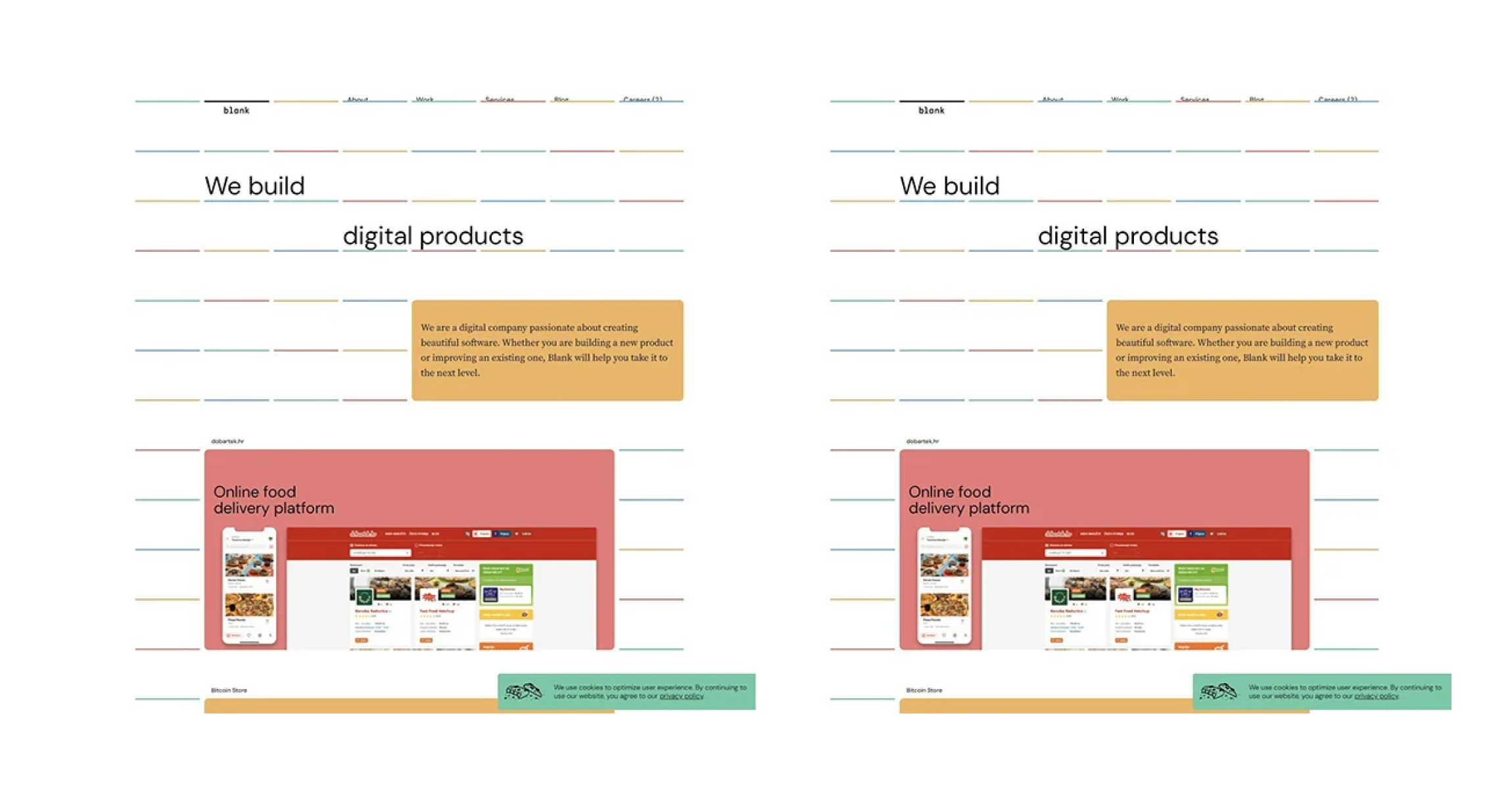
User experience is greatly affected by web performance - just remember those websites you visited, wanting to find simple information, and when you clicked on a specific link you were faced with a white screen. You, of course, understand that the page is loading, but your frustration increases with time passing.
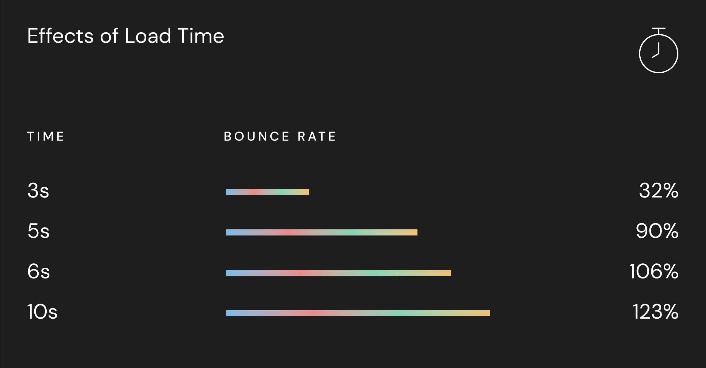
An average time that will irritate you is 2 seconds, but let's say you are a patient person, statistics say that your patience will run out at around 5 seconds. After that, you will furiously leave this page and go to another website to find your much needed information. This is what we want to avoid at all costs.
Furthermore, we can say the success of our website is connected to performance because that is the way to retain our users and customers.
The Google recommended page load time should be under two seconds:
🎯 SEO
SEO stands for Search Engine Optimization, and you as a developer want to have this aspect covered because you want people to come to your site through organic search. Therefore, If you want a good SEO score, one of the things to look for improvement is performance. In 2020 Google announced that they will update their search algorithm and the next upcoming change will have to do with site performance.
💡 What can you do about it
Let’s see the steps and actions that have been taken to improve the project I was working on, and the result it produced!
But before we start, let's prepare our environment
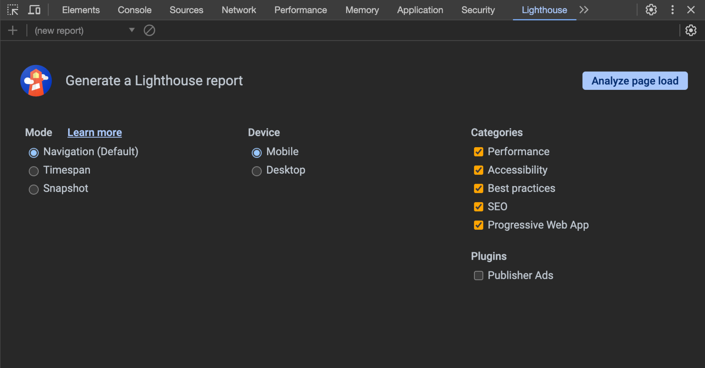
We are going to use Google lighthouse tool to test our performance,
Next step is opening your website in incognito mode, this will disable all your add-ons that can affect the lighthouse
Accordingly, the thing to take into account is Lighthouse Variability - when you run it multiple times it may give you different results. When your performance score results fluctuate, it's usually due to changes in some of the underlying conditions:
- Internet traffic routing changes
- Testing on different devices, such as a high-performance desktop and a low-performance laptop
- Browser extensions(add-ons)
- Antivirus software
That's it, now let's get to business!
🖼️ Optimizing images
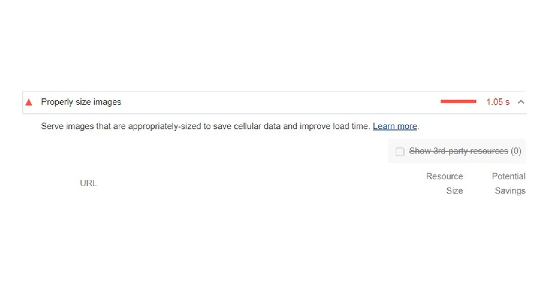
Images tend to be one of the main reasons for low performance, mostly due to their size (width and height, large size 1MB or more).
You may get a low score on the lighthouse and run into this:
Things to change:
- Use WebP or AVIF file format even though neither of these file formats are yet industry standard, although WebP is much closer to being an industry-standard since most modern browsers support it. WebP lossless compression is 26% smaller than PNGs and its lossy compression is 25-34% smaller than JPEGs. The Main advantage of WebP is its versatility—it incorporates both transparency and animation. AVIF images are typically around 50% smaller than the equivalent acceptable quality JPEG web file and can produce far greater savings at an almost unnoticeable loss of detail. It supports 10 and 12-bit color at full resolution, resulting in images that are up to 10 times smaller than other known formats. If we ought to use these formats we should create a fallback option for browsers that don’t support these formats yet, to avoid that missing image symbol
<picture>
  <source srcset="/assets/images/.../image-name.avif" type="image/webp" />
  <source srcset="/assets/images/.../image-name.webp" type="image/webp" />
  <source srcset="/assets/images/.../image-name.jpg" type="image/jpg" />
  <img src="/assets/images/.../image-name.jpg" alt="fallback image" />
</picture>
- If you want to avoid these newest formats for the time being, until they become widely used, you can use an already familiar industry-standard JPG or PNG. Iff possible you should always go with JPG(JPEG) instead of PNG, especially if you don't need a transparent background. Generally JPEGs have smaller size and faster loading time
- Reduce images width and height - if your image placeholder is 600x400 px you don't need an image that is 4200x2200 px. Larger images mean more memory, and in the end slower performance
- Image compression is a must! Compression means same quality lower size, typically performed through an image/data compression algorithm such as Fractal algorithm, or a technique called “quantization”, reducing the number of colors, for example, 24-bit PNG files can be converted to much smaller 8-bit indexed color images. This technique is used by tiny png. There are many more online compression options available
After compression and reducing width and height
- First image 85.2 Kb
- Second one 2.3MB
Same quality!
⚙️ Cumulative Layout Shift (CLS)
Layout shift occurs any time a visible element changes its position from one rendered frame to the next, and from that understanding, CLS is a measure of the largest burst of layout shift scores for every unexpected layout shift that occurs during the entire lifespan of a page.
Official CLS scores used by Google’s performance tools are as follows:
- Good – CLS below 0.1
- Needs improvement – CLS between 0.1 and 0.25
- Poor – CLS above 0.25
To avoid poor CLS we can start with images first, by setting the width and height attributes on images. This ensures that the browser can allocate the correct amount of space in the document while the image is loading.
Just add:
<img src="image-name.jpg" width="640" height="320" alt="Avoid poor CLS" />
You may notice that the width and height above do not include units. Modern browsers now set the default aspect ratio of images based on an image's width and height attributes to prevent layout shifts. What we did above is that we created aspect-ratio: (width) / (height), so you can find and adjust which aspect-ratio fits your project image and add it as shown above.
or if your image is in a container, we can add in CSS
.img-container {
height: auto;
width: 100%;
}
Also besides images, ads, embeds, and iframes without dimensions can cause poor CLS.
📝 Fonts and CLS
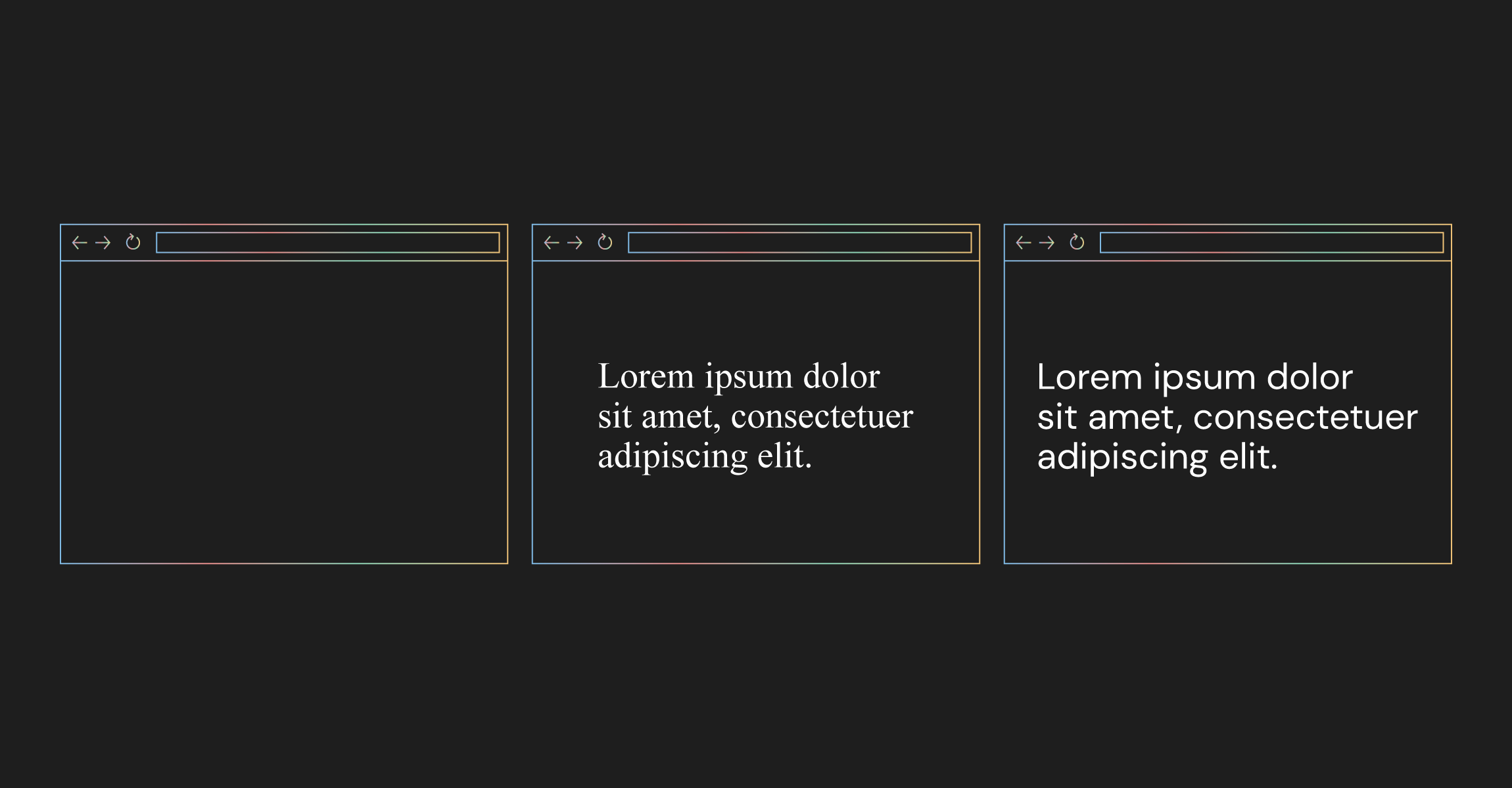
When loading our fonts in a standard way, we can't really avoid the flash of unstyled text (FOUT). That split second when the website is loading and it uses a substitute font until it loads your custom one. Fonts are generally last to be loaded, so there is no need to be surprised about this effect.
In order to minimize the effect of this scenario, we should always preload fonts. The reason you want to avoid this situation, aside from poor CLS, is that it slows down the perceived page load time for your visitors, which leads to a deteriorated user experience.
You can preload google fonts like this:
	<link rel="preconnect" href="https://fonts.gstatic.com" />
	<link rel="dns-prefetch" href="https://fonts.gstatic.com" />

	<link
        rel="preload"
        href="https://fonts.gstatic.com/s/your font that will be downloaded"
        as="font"
        type="font/woff2"
        crossOrigin="anonymous"
    />
    <link
       rel="preload"
       href="family="your font"&display=swap"
       crossOrigin="anonymous"
       role="link"
     />
🦥 Lazy loading
-
Lazy loading images mean to load images only when the user scrolls to specific images or content. Good analogy, why lazy load is something we should use as much as possible, is to think about users with slower 3G network speed. When a website without lazy loading, images that the user will probably never see are downloaded, creating a bad user experience.
There are many ways to implement lazy load, first and simplest way is adding in your image component loading="lazy"
<img loading="lazy" src={} alt={name} />
Next.js Image component already contains lazy loading. There are also many packages for React that include lazy load for images and components, I used react-lazyload package, it has the option of adding a placeholder for preloaded images which can be blurred. Those images have smaller sizes. What this effect creates is that the user sees placeholder or lower quality images that can be bundled together with the js code, and therefore load time is perceived much faster than it actually is.
✂️ Code Splitting
As stated by MDN :
Simply put we can choose how to load our code chunks, and then split them in smaller chunks, because we don't want to have one big chunk which has to be downloaded every time a user loads a specific page.
This is what React docs say about code splitting
Straightforward way for code splitting is dynamic import. In the Next.js framework, dynamic import is part of the Next.js ecosystem, so you can easily dynamically import your components as shown below.
import dynamic from 'next/dynamic';

const DynamicComponent = dynamic(import('../components/hello'));
Bear in mind that only when we disable Server-side rendering (SSR), the dynamic import will be loaded in runtime.
If you work on React app you can add React.lazy
const OtherComponent = React.lazy(() => import('./OtherComponent'));
If you are not working with Next.js you can take a look at how to set up webpack for code splitting. Another interesting post to read about suspense and lazy load can be found here.
Let's see why is dynamic import so powerful
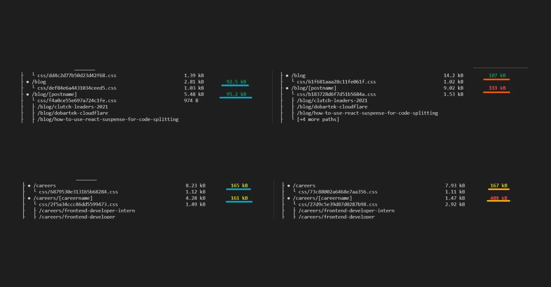
Now what you are seeing underlined here is First Load JS, before and after dynamic import, and you might ask what is First Load JS?
Next.js documentation defines it like:
- The number of assets downloaded when visiting the page from the server. The amount of JS shared by all is shown as a separate metric.
Simply put it's all the JS your website requires to start rendering your content. We want to keep this number in green color and as small as possible.
🛑 Deactivate prefetch
Next.js has its own Link component, which by default has a prefetch prop set to true. Therefore Next.js Link component automatically prefetches all pages, in simple terms all JavaScript that is needed to render the page. This enables quick loading of navigation links, but it scores badly with the Lighthouse performance tool because it is seen as redundant JavaScript code. Even though it is reasonable to keep prefetch active, on behalf of optimization and to be on better terms with google algorithm let’s use deactivate prefetch:
import Link from 'next/link';

 <Link href="/" prefetch={false}>
Note when prefetch is set to false, it means prefetching will still occur on hover.
🌲 Tree Shaking
Tree shaking is a term commonly used within JavaScript context to describe the removal of dead code, making it a great metaphor for what it actually does - shakes our project and drops dead code. Dead code means unused code, so every time a page loads, the browser downloads, parses, and executes JavaScript files before it can render anything on the page. Large JavaScript files could lead to issues, potentially delaying your page's First Paint as the browser is blocked from processing other critical tasks. As a result, this increases the time your visitors spend waiting for the page to display something, which should be avoided at all costs.
To implement tree shaking for webpack, you need to add in your package.json just,
"sideEffects": false,
As described in webpack docs here, when running your app you should see any potential issues immediately, because we told webpack to delete all unnecessary code. To avoid unwanted side effects you can specify which files to exclude from the process.
  "side-effects": false,
  "side-effects": [
    "name-of-file-to-avoid.js"
  ]
🔎 Webpack analyzer
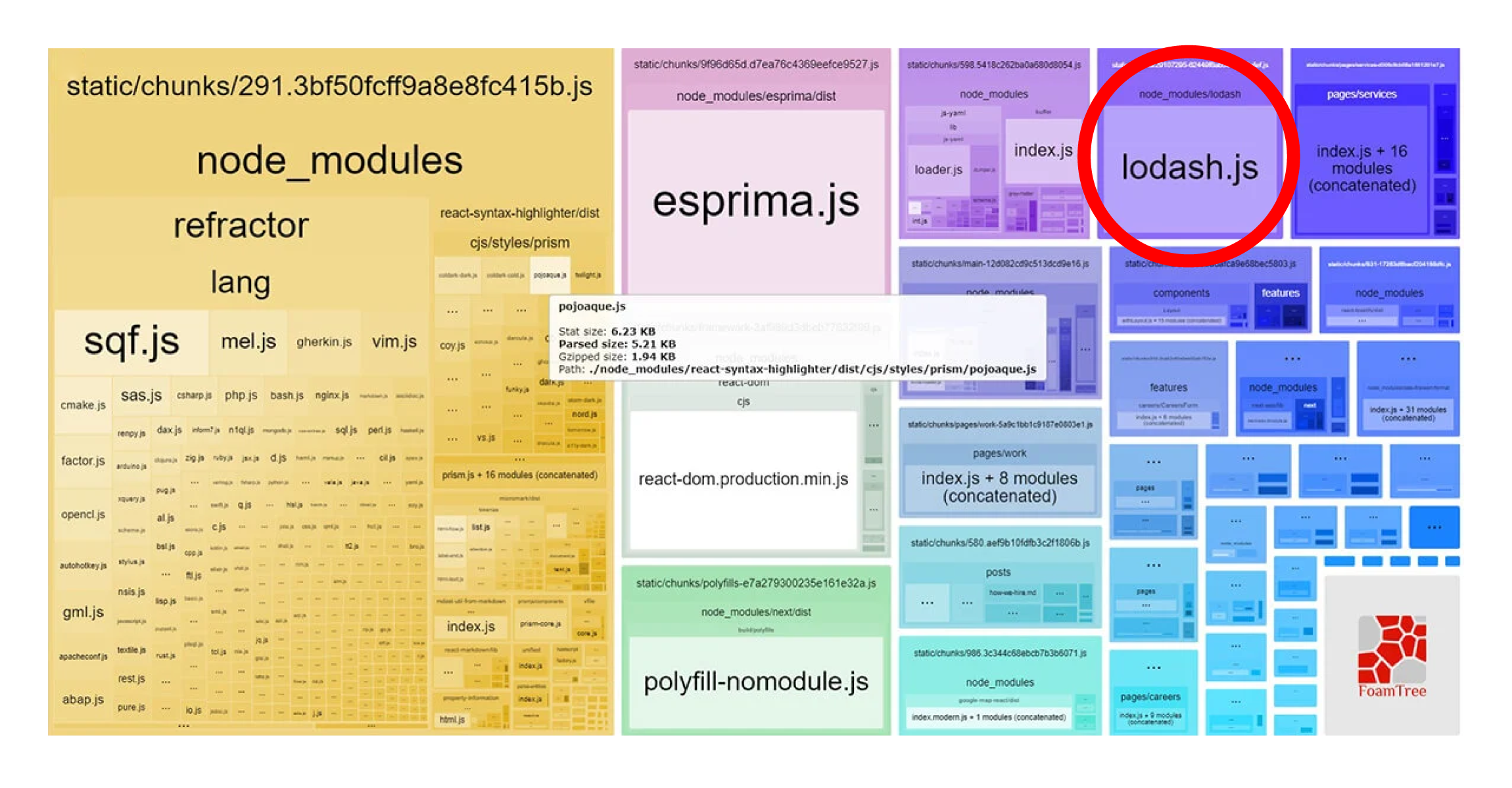
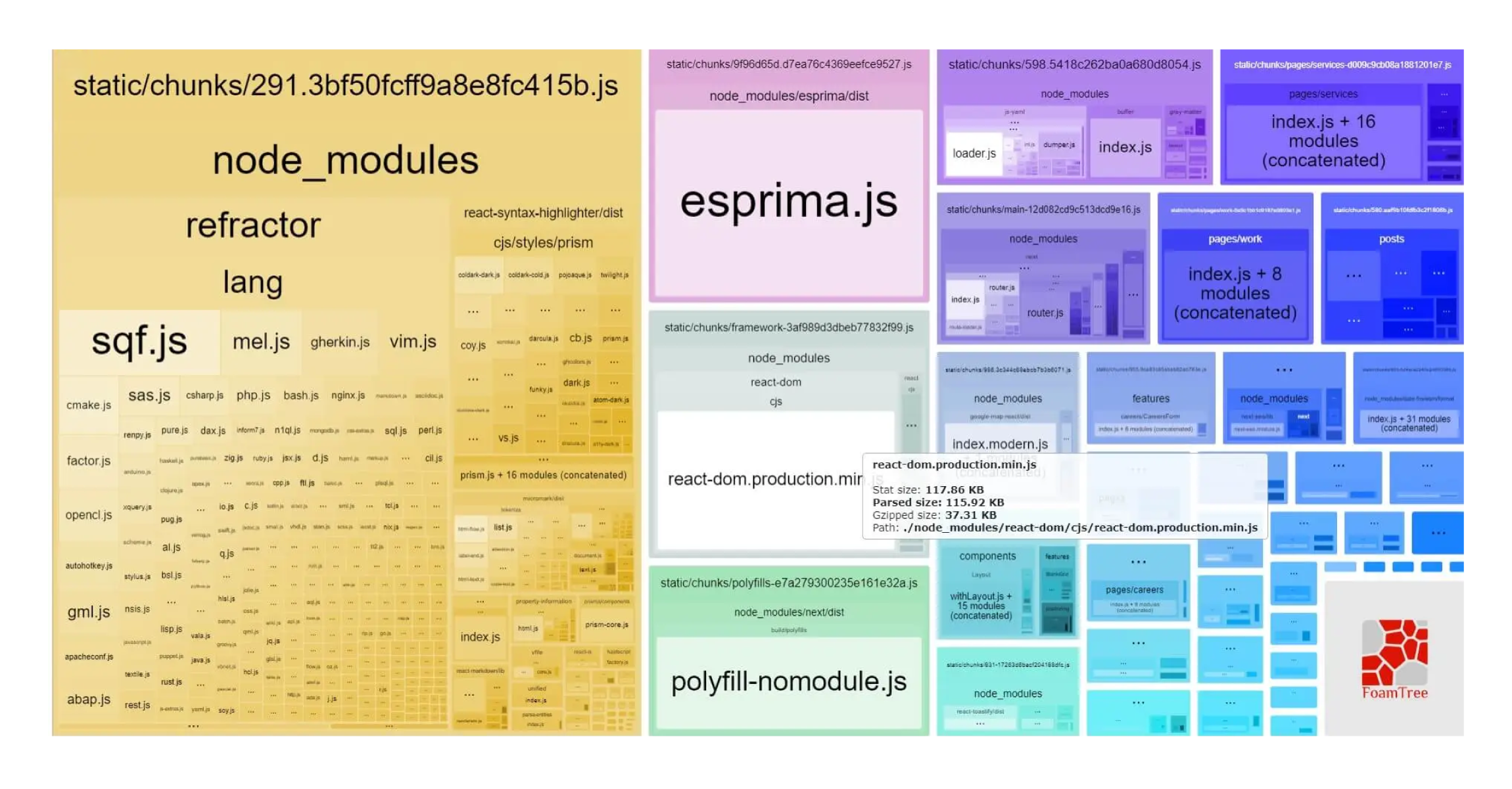
Another powerful tool to use when working on performance optimization is the webpack analyzer. Using this tool we can see what all those chunks created by webpack are made of. When you run it, you can see something like this:
To Setup, when using Next.js you can install package @next/bundle-analyzer here add in package.json :
"scripts": {
    "dev": "next dev",
  ...
  ...
    "analyze": "cross-env ANALYZE=true next build",
    "analyze:server": "cross-env BUNDLE_ANALYZE=server next build",
    "analyze:browser": "cross-env BUNDLE_ANALYZE=browser next build"
  },
in next.config :
const withBundleAnalyzer = require('@next/bundle-analyzer')({
  enabled: process.env.ANALYZE === 'true',
});
module.exports = withBundleAnalyzer({});
and run it in terminal
yarn/npm run analyze
Now you can see if some installed packages are using too much memory, or if there are some irregularities with packages overall. What I encountered when analyzing, is that lodash was taking too much memory (around 500kB), which from the perspective of all bundled packages is an enormous value. This unusual size of bundled package impelled me to check how we used loadash. The issue was that we only used one simple function from lodash, but rather than importing the one function, we imported the whole package, causing the bundled lodash chunk to be so large.
Import  _  from 'lodash'; // inadequate way to use lodash

const indexes = [];
  _.each(_.range(1, size), (value) => indexes.push(4 * value));
  return indexes; //usage of function
After
import each from 'lodash/each';

const indexes = [];
each(range(1, size), (value) => indexes.push(4 * value));
return indexes;
There is no more lodash in sight, because it's too small.
Difference is in 500Kb!
There is another package to look at, called lodash-tree-shaking which can be useful specifically when using the lodash package.
The Next great tool that can help you with optimization is a VS code extension called Import cost. This tool helps you see and analyze your imported packages and shows the size of the packages and their gzipped size (compressed package by webpack) beside the import of the package. At the time of writing, there was a problem with a package called react-syntax-highlighter because it was too large, and there wasn’t a fix available.
First approach was to reduce the package size with dynamic import and importing the light version of this package, in this case prism-light. However, while it reduced the package significantly, the package was still too large. After almost giving up on reducing this package, the Import cost extension saved the day - it showed how one style, imported for this package, took an enormous amount of memory. After further investigation, a similar style with inconsiderable memory space was found.
Webpack bundled before and after:
From 766.29 KB to 132.1 K KB!
With package analysis it’s obvious how many performance issues are caused by large packages. When choosing a package we should analyze it first, see the actual size, and then decide if it is the right choice for your project or simply find an alternative package with significantly less size. Bundlephobia can help you while choosing packages
🧠 Psychology of Web Performance
Let's assume we tried everything we could to improve our site performance. We went through all steps listed above - from optimizing images to reducing our packages as much as we can. We hit a dead-end, and can’t improve our performance anymore, now it’s time to focus less on objective parameters like numbers and scores provided by lighthouse. We should switch our focus to the psychology of web performance which is actually the psychology of waiting. We already mentioned user experience and effects of time, but the issue is we perceive time subjectively. A crucial aspect of perceived time is waiting.
There is a whole research area dedicated to the psychology of waiting, a great example is David Maiser research on waiting in lines with the brilliant quote:
The solution to this is "Occupied time feels shorter than unoccupied time". You were already a part of some real-world examples - it is common practice in restaurants to hand out menus for customers to peruse while waiting in line. Another great example closer to our topic is Google’s Chrome dinosaur game. It was added to source code because people would perceive Chrome browser slower if their device’s internet connection was disconnected and waiting between connecting again would be associated with the browser performance.
Uncertain waiting is longer than known defined waiting. Let’s say you land on a web page and a pop-up modal says that you have to wait for 3-4 seconds due to high traffic and overcrowded services. You will be annoyed at first, but then, you will accept it and relax. However, imagine you saw a message, saying something like “you will soon be redirected” and nothing happens. This brings you in a state of nervous anticipation, and eventually, you will feel that service takes much longer and overall have a bad experience.l have a bad experience.
Unexplained Waiting is longer than explained waiting, it is in a way connected with uncertain waiting. If you are offered an explanation why you are waiting, for example pop-up modal “please wait for the order to be accepted, it tends to be high traffic at this hour”, you will have more understanding and fall back into your comfortable relaxed state. On the other hand, if you are faced with page loading with no explanation you tend to blame the web application and have a bad user experience.
More valuable service, the longer customer is willing to wait. A simple example is our common experience in restaurants. We will accept a much longer waiting time in a fancy, high priced restaurant than at a local fast food place. Our tolerance for waiting is conditioned based on the value. In web applications, we should be aware that the customer is more eager to wait while using payment processing transactions service than using an application to schedule a meeting.
As explained before, after 5 seconds of waiting 90% of users will leave the page, but if we’re unable to improve performance for some reason, then we should make sure we follow the rules of waiting and engage our customers with:
- Message with defined waiting
- Message with explained waiting
- Understand how valuable specific services are to users and with that knowledge arrange waiting time
Entertain users while waiting with:
- 🕹️ simple games
- 🔄 animations: implement skeleton loader, loading animation...
- 💬 messages
In Conclusion
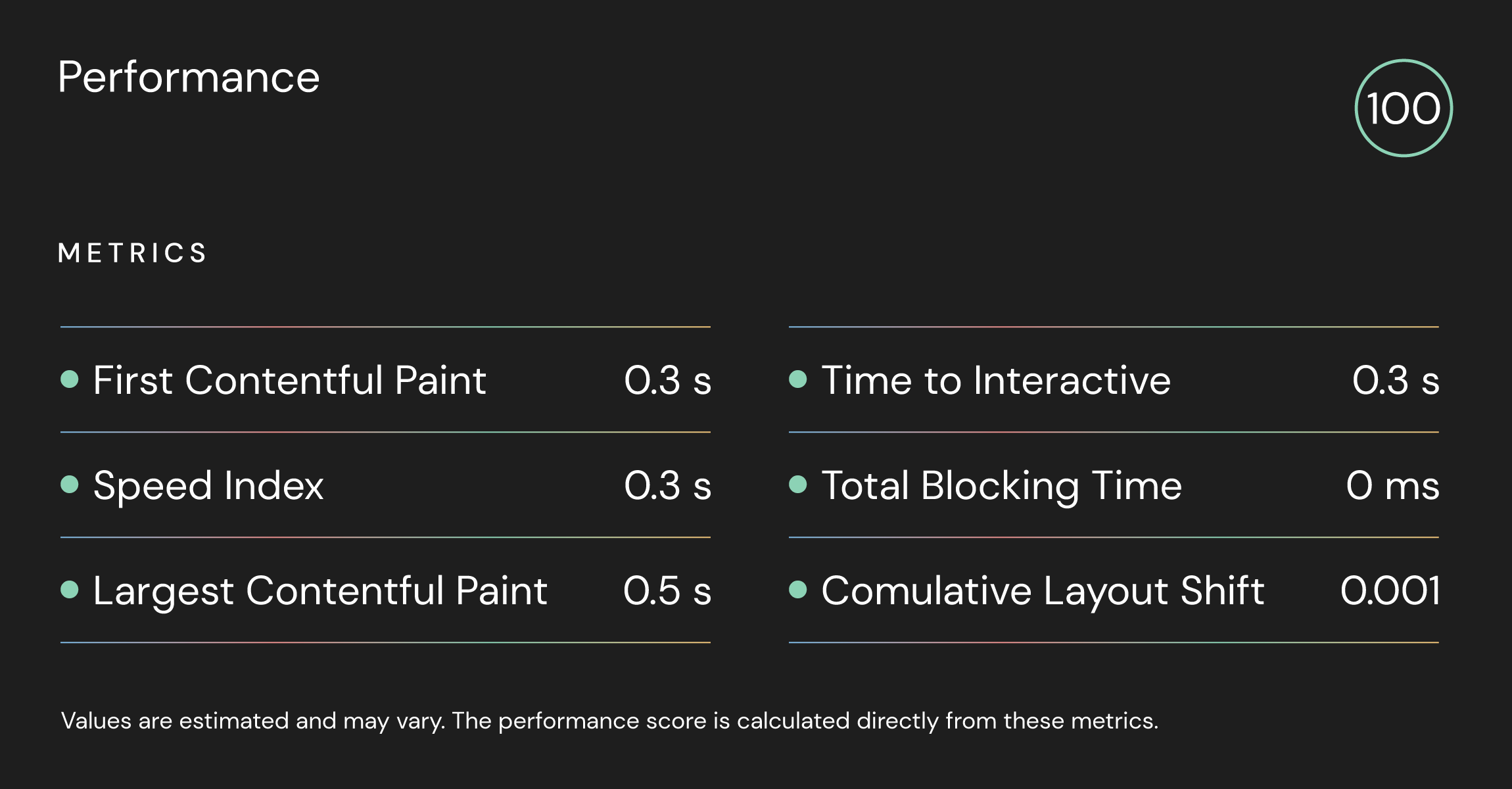
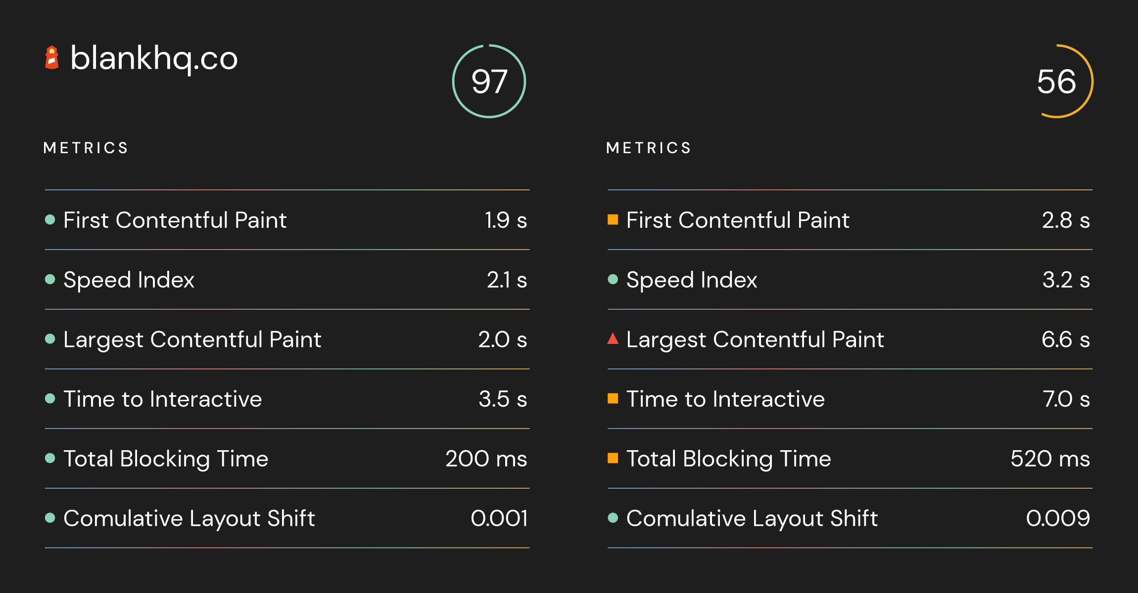
There is much more that can be said about performance optimization, but this short guide can get you to 90% and above in the Google lighthouse performance tool. Presuming that you followed this guide and done all the steps after you run your project you can see similar results.
Here are the results:
We can't ignore performance if we want to make a serious and professional Web application. An interesting thing to have in mind is that mobile users are increasing, mobile users account for approximately half of the web traffic worldwide today. Therefore we should focus more on mobile users when testing performance.
In the end, I will leave you with this interesting psychological effect
(taken from Time Is Money by Tammy Everts)
